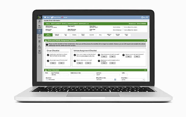
UX Case Study / Driver Checklist
Challenge
New users are not able to quickly add and identify common tasks for adding new drivers
Approach
User focus group (internal only)
General usage data on popular features
Role, scope, and constraints
What was your role? UX Lead
What was the timeline of the project? 2-3 months
What were the platforms or constraints? Lack of time to perform external user research, technical limitations due to being built on older framework.
Results
Even without proper UX research, we received positive feedback from external users
The Research and Process
The Process
Our UX process at Element is still being changed so the process is being defined, implemented, reflected on, and then further refined with each project.
With this epic the following process was used:
Understand: Used internal focus groups to understand the challenge and benefits
Research: Analyzed internal data, researched best practices for UI checklists.
Design: Used data and UI research to develop a flexible UI pattern that can be added to, bringing modern touches to the application that isn’t disruptive to the prior UI.
The Research
What did you do?
I helped lead conversations with internal SMEs to understand what the requirements were for adding a new driver. Once that was understood we used platform usage data to confirm the functions were being used across all fleets.
What was the result?
The result was a comprehensive list of 7 functions that need to be completed when a manager adds a new driver. These functions can be completed without the action of an internal resource.
Design Iterations
To Last
From 1st
The Results
Usage of the individual’s process increased based on the prior year’s data. Users loved the enhancements and it helped them be more effective. We have also had takeaways that could have been caught if proper user testing had been conducted.
Feedback From Users
MUCH EASIER PROCESS TO ADD FUEL PIN
It’s effortless and efficient. Love it!
I LOVE THE NEW CHECKLIST!!!! THANK YOU!!!
Makes this process so much easier and more efficient since its helps user from missing steps.
Great Job GE FLEET
I can see where this would be very effective for someone new to the system
Love that you can do everything from 1 screen
Annoying as I don’t want that popping up. I can see how it would be helpful to others though. It would be ideal if this could be an item that could be turned on or off in the preferences


